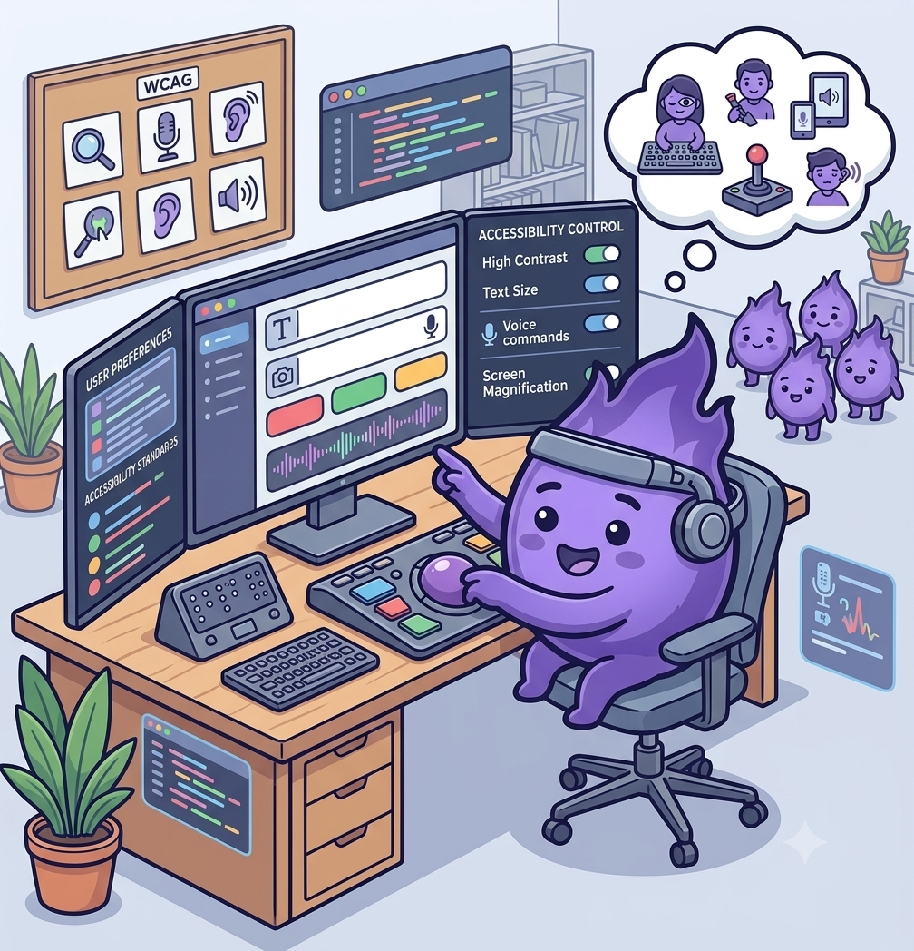
Making participant-facing apps accessible by design
A remote-first study is only as inclusive as the app participants are asked to use every day. If that app is hard to read, hard to navigate without a mouse, or built on the assumption that everyone can hold a phone steady and respond quickly, it quietly narrows who can take part, regardless of how broad the eligibility criteria say the study is meant to be.
Accessibility is easy to treat as a compliance checkbox added near the end of a build. Retrofitted that way, it usually means redesigning exactly the screens participants rely on most: forms, diaries, and consent flows. Built in from the start, most of it comes down to a handful of decisions that don't cost much more to get right the first time.
Design for more than one way to interact
Not every participant can use a touchscreen with precision, read small text comfortably, or respond to a task within a tight time limit. Text that resizes without breaking the layout, sufficient colour contrast, full support for screen readers, and generous tap targets cover a large share of accessibility needs on their own. One study comparing standard and zoom-enabled versions of an electronic outcome assessment found the two produced equivalent results, which matters directly here: making an interface more accessible doesn't have to mean collecting different or lower-quality data.
Build for cognitive load, not just physical access
Accessibility is often discussed in terms of sight and motor ability, but cognitive accessibility deserves equal weight in a study context. Clear, plain language; one task per screen rather than several; and the ability to pause and resume without losing progress all matter for participants managing fatigue, brain fog, or a condition that affects concentration. A usability study of an ePRO platform used with traumatic brain injury patients found that small interface choices, such as how instructions were phrased and how much a participant had to hold in mind at once, made a measurable difference to whether people could complete a task independently at all.
Test with the participants who are usually left out of testing
Standard usability testing tends to recruit people who are comfortable with technology and confident giving feedback, which is exactly the group least likely to surface accessibility problems. A tool built to support care for patients with complex chronic disease and disability found that testing directly with that population uncovered friction points that hadn't shown up in earlier rounds: a study platform can pass conventional testing and still be genuinely difficult for a meaningful share of its intended users.
Treat accessibility as part of protocol design, not just app design
Some of the biggest accessibility barriers aren't in the interface at all. A visit scheduled at a fixed time with no flexibility, a task that assumes reliable broadband, or a consent process that assumes fluent reading in the study's default language will exclude people before the app is even opened. Accessibility works best as a question asked throughout protocol design, not bolted onto the technology afterwards.
Designing for accessibility from the outset costs little compared with retrofitting it later, and it directly affects who a study can actually reach. An app that only works well for the most digitally confident, most able-bodied participants isn't collecting a representative picture of anything.
References
- Measurement Equivalence of Standard and Zoom-Enabled Electronic Clinical Outcome Assessments: Implications for Patient Accessibility in Clinical Trials
- The Electronic Patient Reported Outcome Tool: Testing Usability and Feasibility of a Mobile App and Portal to Support Care for Patients With Complex Chronic Disease and Disability in Primary Care Settings
- Testing an Electronic Patient-Reported Outcome Platform in the Context of Traumatic Brain Injury: PRiORiTy Usability Study